

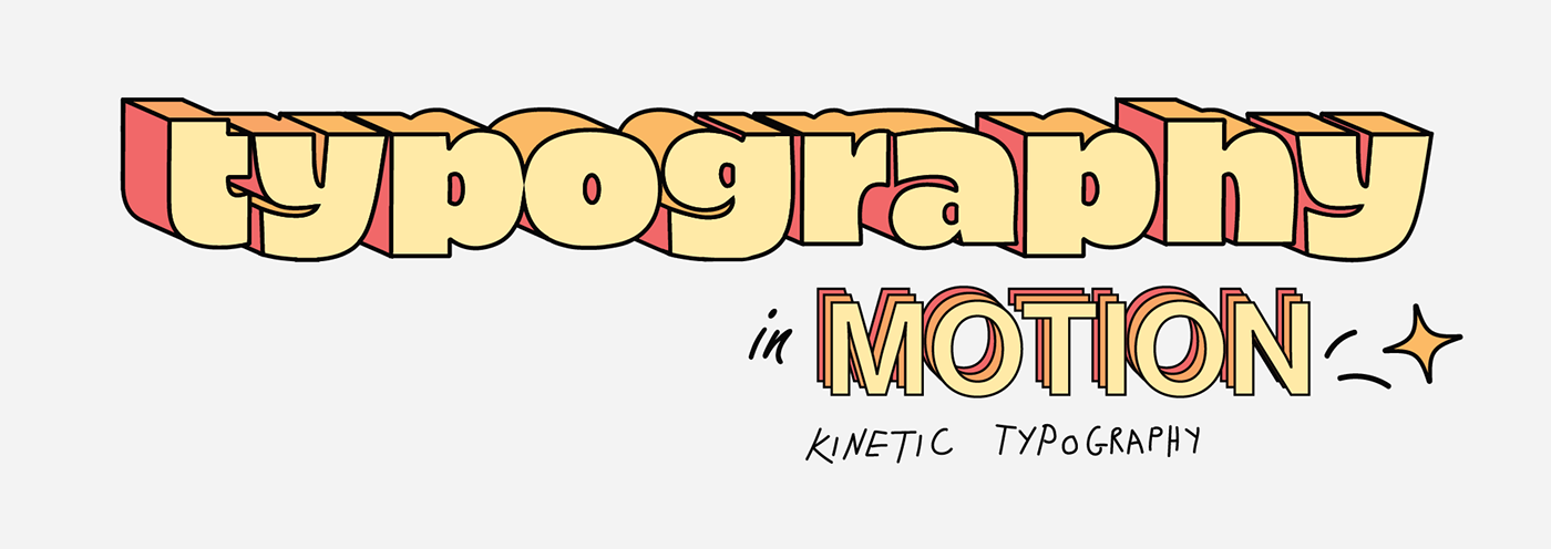
This short collaborative project is the process of merging typography and motion to convey our narratives as students at Greenside Design Center. Our goal was to share our experiences through kinetic typography through using emotive prompts for the letters G, D, and C. By considering the 12 Principles of Animation, we successfully created 3 animations that share our experiences as student designers.

We were asked to reflect on our personal experiences as students at Greenside Design Center. To do this, we used emotive prompts that helped us dig deep into ourselves and think about our personal concepts. After many refinements, we finally had our refined concepts, and we combined them. It was a challenging process that involved starting from scratch several times, but we eventually succeeded in creating a meaningful reflection on our experiences as students.


We carefully selected the color palettes to emphasize our narratives in the prompts. A single palette was used for each of the initial two animations, and in the final animation, we combined both of them to create a strong impact.


This animation features a retro television, symbolizing our appreciation for vintage things. It is a combination of our concepts intended to represent both of our narratives. It highlights the struggle that we as designers often face when using Adobe softwares like After Effects, which can be incredibly taxing on our computers and devices, leading to crashes. When looking at the screen, one would notice a letter G designed in the Helvetica font. The top part of the letter is fashioned like a pick axe, symbolizing a mine. The bottom part represents a power station. This design represents one of us coming from a mining town.


We have a strong sense of ambition and drive, with one of us being eager to tackle complex projects head-on, and the other committed to using design to positively impact the future. While we are confident in our abilities, we also recognize the importance of protecting ourselves from negativity. As a symbol of this, we have incorporated an eye into our shield.


We describe ourselves as futuristic, not necessarily interested in a sci-fi sense of the future, but rather in what lies ahead for us as aspiring designers. Initially, we were nervous about what was to come when we first started out as students. However, now we look forward to it with excitement, and that inspires us even more. We aim to be open-minded to change and to recognize that change has the potential to positively impact our growth and development while not forgetting our roots as aspiring designers.


Vintage Animation: Megan Kai Potgieter, Zakhele Ngubeni
Bold Animation: Megan Kai Potgieter
Futuristic Animation: Zakhele Ngubeni
Grammarly Rewrite assisted for better and more effective communication.


